Monday 9 November 2015

Inktober Week 4

Whoa there! It's the last week of Inktober and I managed to complete the month with an odd selection of fish hooks, creepy crawlies, architecture and finished up with another live 30 minute drawing at the National Theatre. Love that place. It's full of perspective, awkward lines and surprising textures. 

It's been a fantastic month of drawing for a number of reasons:

- It's got me back into drawing (just bought a load more paper and inks)

- I've tried and discovered new techniques 

- it was a healthy discipline to be creative every single day. 

- it got me away from the computer

- I discovered a global ink drawing community and felt part of it

One final observation: As you know, I posted each day's drawing on Instagram. Guess which drawing got the most likes in the whole month... Day 9 (see below) The one that I did after an accidentally boozy evening at The Ivy! Really NOT my best work but there is no accounting for taste :-) 

Thank you to all my friends and fellow Inktoberists who have taken the time to 'like' my drawings. I'll be back next year for sure.


Day 22


Day 23 & 24


Day 25


Day 26


Day 27 & 28


Day 29


Day 30 (Halloween special)


Day 31


Sunday 1 November 2015

Inktober Week 3

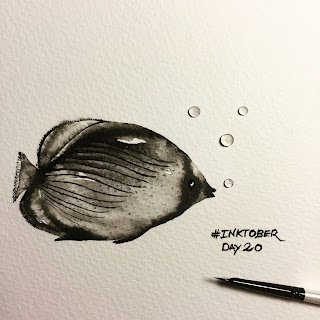
This week I was inspired by retro condiments, birds, fish and beetles. Some more successful than others (sorry puffin!)


Day 15 (part two of day 14)


Day 16


Day 17


Day 18


Day 19


Day 20


Day 21


Wednesday 21 October 2015

Inktober: Week 2

Amazingly I've managed to keep this up. I'm loving it! I can't say I've made huge improvements but I've learnt new techniques and tried some more challenging subjects. This week I braved a 'live' draw inside the National Theatre as well as a more detailed two day study of the outside of the building. I dabbled in calligraphy and realised just how difficult it is to draw drunk (see day 9).

DAY 8


DAY 9


DAY 10


DAY 11


DAY 12


DAY 13


DAY 14


Wednesday 14 October 2015

Inktober 2015

I've decided to take part in Inktober this year. It was set up by illustrator and graphic artist Jake Parker and has happily gone viral. People all over the world do an ink drawing each day of October and post them on some form of social media. I'm using instagram. I'll post the weeks round up of drawings here. It's a challenge but it's got me back to drawing again and I'm loving it. Sometimes I have to post some drawings I'm not happy with, but it's a process which I hope will see some improvement over the month. So here goes...


Sunday 10 May 2015

My Porto Top 10

If you're heading off to Porto on the the North West coast of Portugal here are my top 10 things to do, see and eat;


1. Buy a ticket on the City Sightseeing tour bus. This may seem like a crazy tourist thing to do but use it wisely and it can save you a lot of money and help get you up those very steep hills. The trick is to buy your ticket at about 12pm as they last for 48hrs and you can hop on and off wherever you like so use it as a taxi for the next two days. Of course it takes you the scenic route and after two days using this bus you'll know the city like the back of your hand. When we went it also included a free tour and tasting at the Cruz port distillery and a 6 Bridges boat tour. It's a great way to get your bearings.

2. Hire a bike and explore the Atlantic coast. There is a fantastic bike path all the way to Lisbon. Well, I'm not sure it goes that far but it feels like it. We hired bikes from a cheeky chappy at Vieguini Bike and Scooter Hire Brand new bikes and he gave us some good tips on where to go.


3. Eat BBQ fish. If you go North up the coast on your bike (or Route A on the metro), you will reach the busy working port area of Matoshinos. At the weekend the first thing to hit you is the mouthwatering smells of bbq fish. Go exploring through the streets, don't just go to the restaurants near the sea. We went to Nuno Malafala Restaurant, corner of Av Serpa Pinto / r. Sul. First you choose your fresh fish from the ice box and then it gets gutted and cooked to perfection on the bbq in front of you. The BEST fish dish you will ever have.

4. Wander the port district. There are loads to choose from. Just wander in and you can choose from a variety of tours prices start from about €10. Our favourite was Cockburns. At least thats the one I can remember...


5. Party in Rue Galerias Paris just off Rue Carmelitas. Packed full of cool bars although if you even attempt to go there before midnight you will be on your own (unless you are there for lunch, see below). 2am on Saturday would be a good time to try. If you are looking for some Gay nightlife, its few and far between however we enjoyed Café Lusitano if you are lucky, it may be tarot card reading night...

6. Have lunch in Restaurante Bar Galeria De Paris, Rua Galeria de Paris, 56. Quirky, cheap, cafeteria style restaurant with a formidable maître d. She mixes a mean Sangria though. All the food is very home style and delicious.

7. Have dinner Restaurante Zé Bota, Travessa do Carmo 16, 4440-452 Porto. The food is delicious and the atmosphere can be pretty lively. Be warned - they are very generous with the carafe of wine measurements. And the wine is good, and you may need a taxi to take you home. Alternatively try Restaurant BookRua do Aviz, 10 , retro style book shop vibe with modern cuisine. Slightly slow service but worth the wait.


8. Visit the Sunday BIRD market. Yes there is a bird market on Sunday morning (R.Campo dos Martires da Patria). It's mesmerising, not just the vast array of budgerigars and cages and bird seed but the people who are actually buying these poor things. They literally  take a bird from a cage, pop it in a paper bag and off they go... Not for the feint hearted but compelling people watching nonetheless. 


9. DO NOT eat the local dish Francesinha. No matter how they try to photograph it, the camera never lies. It's quite repulsive. 


10. Watch the sunset over the Douro from a tiny little local bar on 51 Passeio das Virtudes. If you have just climbed the steps from the river front you are going to need at least Three Super Boc, maybe four. It's thirsty work all this climbing. Did I mention the hills in Porto?


Sunday 8 March 2015

Tell Me a Picture

This weeks highlight was meeting Sir Quentin Blake. Together with Roald Dahl, he brought books to life for me. It was the Enormous Crocodile that had me hooked and from that moment the power of illustrated children's books has never diminished. 


Tell Me a Picture was first published in 2001 in conjunction with an exhibition curated by Sir Quentin at the National Gallery.  When we discovered it on the Frances Lincoln back list last year we jumped at the chance to give it a new lease of life. 


I decided not to hack the cover about too much. The elements of a great cover were already there (Quentin Blake illustration and a painting from a 'great master')  but today it will be bought by a different market without the hook of the exhibition and the National Gallery's initial order so it would have to work harder. Anyway here it is:


And we had a party to celebrate the launch at the House of Illustration. The event was also to launch our all new look Frances Lincoln Children's list and our new imprint Wide Eyed Editions and here is our team with Quentin. It was a special evening. 


Sunday 1 February 2015

A Field Guide Font

A big part of my job as a book designer requires me to trawl through pages and pages and pages and pages...of fonts. 

I love a font, don't get me wrong. If I had the time I would peruse font websites and blogs till the cows come home. When I am out I will be scouring the billboards, the flyposters, the mag racks, the shop signage, the speakeasy cocktail menu...

A font is a powerful design tool. Get it wrong and it can trash a perfectly good cover or make a mockery of a serious message and generally trounce your design career good and proper. Get it right and it turns a cover from good to unique or mid shelf to table top display. 

I suffer from font blindness when I have to quickly find one thats just going to 'work' so I am looking into making my own. I usually have a sense of what's required in a book I'm working on. But finding it is just.... argh! We have a font folder of over 2000 licensed fonts at work which I can wade through. It makes me want to stick pins in my eyes after 30 seconds. 

There are some very talented font designers out there and very occasionally a book may have a budget to pay for a license but its rare. So I'm checking out some simple font making software. I've just discovered a seriously simple but fun app for the iPad called iFontMaker Serious font designers, look away now! 

I'm not pretending its going to make the most carefully crafted font by any stretch but it's great for that handwritten naturally uneven look. Recently I was working on a book which we branded as Field Guides and I needed a handwritten child friendly look and I created my Field Guide font in a relatively short space of time and its mine, its unique and easily editable. Below is my style sheet (not the book).


And you can download it here 

It needs tweaking and a whole heap of glyphs but for my first font I'm quite pleased! When the book is nearer to publication I'll post it here and you can tell me if I did a good job..or not! 

I'm currently busy creating a few more. If they are worth publishing I'll let you know.